Mobile application
Learning App to Empower Growth in Hard & Soft Skills
ROLE
Lead UX Designer
EXPERTISE
UX/UI Design
YEAR
2024

Project Overview
The app is designed to provide learners with a flexible and interactive way to acquire both technical and soft skills, offering a combination of video tutorials, quizzes, exercises, and progress tracking tools.
Background
Since the pandemic, online learning has become a go-to for career growth. But while access has improved, consistency hasn't. Many learners, overwhelmed by daily commitments, struggle to stay motivated and finish what they start.
Problem
Users look for a learning platform to teach them the foundation of new skills they are interested in. However, because of their daily commitments, they struggle with time management and they get easily demotivated when they lose track of their progress.
Goals
The app is designed to provide learners with a flexible and interactive way to acquire both technical and soft skills, offering a combination of video tutorials, quizzes, exercises, and progress tracking tools.
Objectives
Interviews
I gathered insights into how users interact with a skill-learning app, focusing on their learning experience, motivation, pain points, and overall satisfaction.
Participants are
Ages 21-35
Experienced in learning a skill online
Have various learning styles


Affinity Map
Few participants had to do some adjustments when it comes to accountability
Some participants mentioned having a better experienced if they can communicate with instructors; Participants who have this feature liked that they have support system in their learning journey
3 of them stated how a progress tracker help with getting them on track, while one participant claimed the ineffectiveness of it.
3 participants used skill learning app to grow their careers or boost their resume.


"I start strong, but once I miss a day, I lose track of where I left off and just... stop."
Feature Set
To initiate the development of ideas for my product, we conducted a brainstorming session to outline a feature set grounded in the previously conducted research and design-thinking process. This task was particularly challenging as it required me to generate ideas that were both unique and differentiated from competitors. To support this effort, I continued to analyze and refine the concepts I had developed earlier in the design phase.

User flows
Signing up and onboarding are critical steps to help users get started with the app and ensure they feel confident and ready to engage. Our goal is to make the process simple, informative, and welcoming—so users can quickly realize the value of our app without feeling overwhelmed

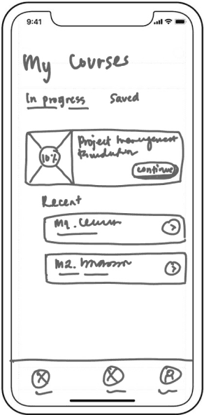
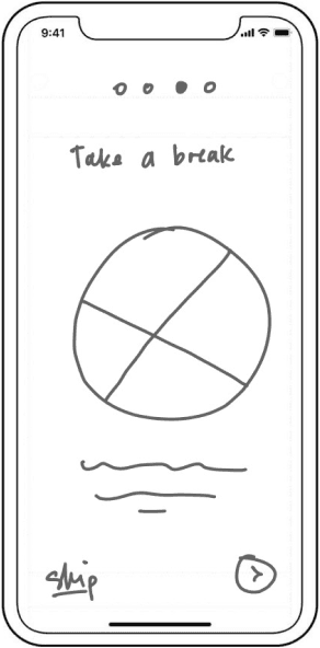
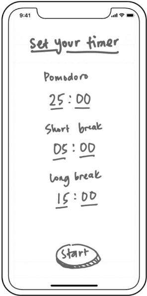
A returning user has completed a few lessons in the course before taking a break. Now, they’re back to continue where they left off. Their goal is to pick up where they left off, maintain focus, and make efficient progress using the Pomodoro technique to maximize productivity.

Wireframes
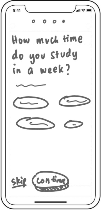
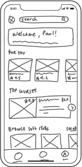
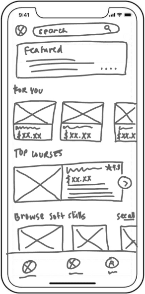
While first-time visitors can browse courses as guests, this user flow focuses on guided account creation. During registration, users provide information on their skills and learning availability, enabling the platform to deliver personalized course recommendations








Brand Identity
— COLOR PALETTE
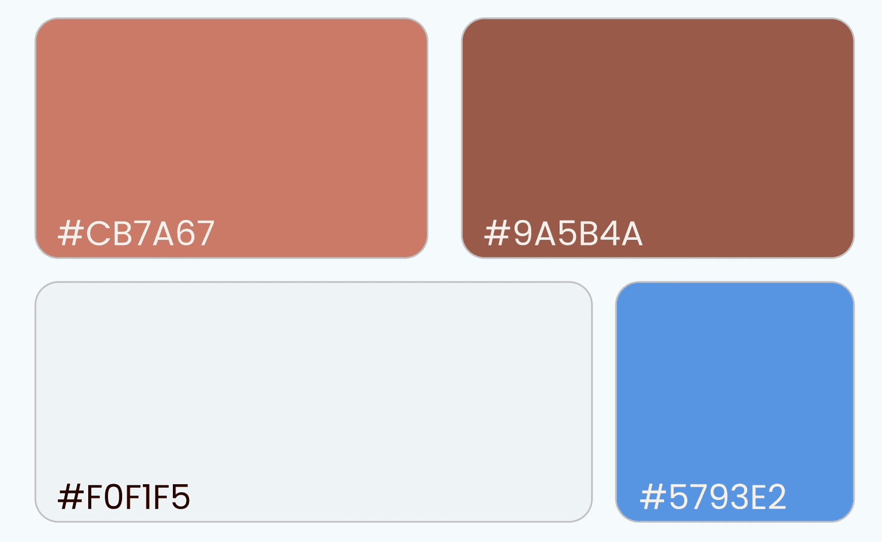
The primary colors, #9B5B4B and #CA7A66, convey a sense of warmth and a welcoming tone while also promoting activity and playfulness. Complementing these, two shades of blue are used as secondary colors. Blue represents intelligence, community, and the future—reflecting the brand's core values.
— BRAND LOGO

— TYPOGRAPHY
For the typography, I selected Yrsa and Poppins due to their complementary qualities that balance readability with a modern and approachable aesthetic. Together, they create harmonious typographic system that enhances the user experience by ensuring both clarity and personality.

UI Component Library

Visual Design



Usability Test
After analyzing user behavior, feedback, and usability testing results, we organized our findings into four categories: successes, areas for improvement, questions, and ideas. This structure provided clarity and helped the design team focus their efforts for the final iteration.

Iteration


On the homepage, we introduced a feature that displays a returning user's most recent course activity, providing quick access to their ongoing or completed learning progress.